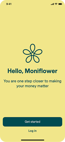
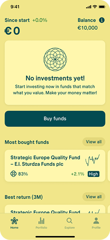
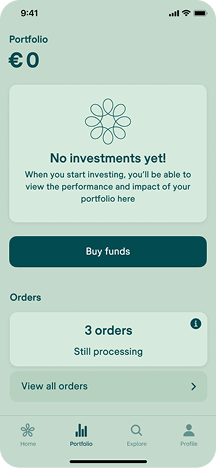
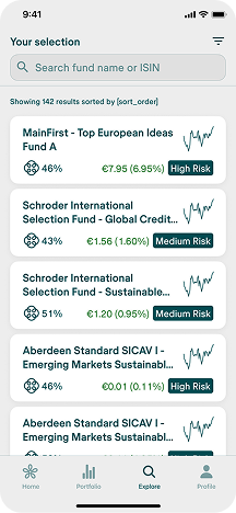
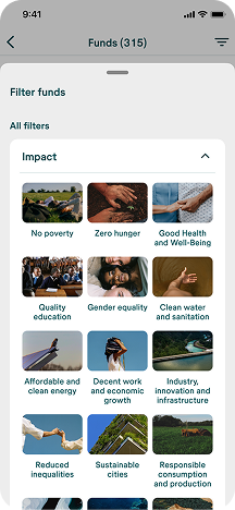
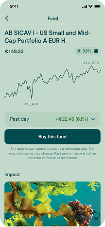
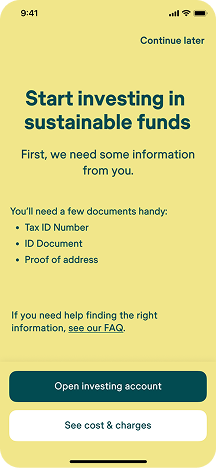
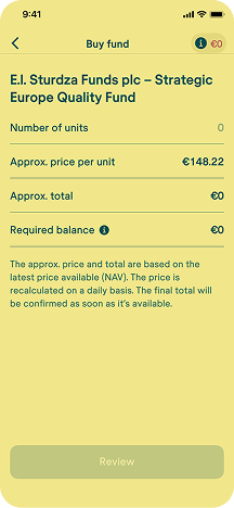
The app worked. What we didn't have was traction.
We knew how far below target we were. What we didn't know was why — whether it was a marketing problem, a product problem, or something bigger. Over the months that followed, figuring out which one it was became the most interesting design work I'd ever done.
During this stretch my role expanded beyond design — I was also making product, customer care, and marketing calls. What follows is the work from that expanded remit.
2.1 / DiagnosticSetting up the instruments
We had intuitions. We didn't have numbers. Before we could run any experiments, I needed to make the funnel visible.
I defined the KPIs around the core stages of the user journey, set them up in our analytics stack, and built a reporting cadence that surfaced them to the management team on a regular rhythm.
For the first time, we could see the funnel shape clearly. It was blunt.
The funnel shape
Most of our users were on Android. That mattered, because a lot of fintech design assumes an iPhone audience by default. We had to design for the phones our users actually had — often older, smaller, slower — and that shaped a lot of decisions downstream.
2.2 / ResearchTalking to users, not just measuring them
Analytics told us where the walls were. It didn't tell us what they were made of.
Our CEO proposed collecting phone numbers during onboarding — not as a gate, but as an option — so we could call users afterwards and ask what was going on. I led the program: designed the phone-number capture flow, prepped the team on how to run the calls, collected the data, and brought the insights back into product decisions.
It turned into a company-wide effort: people across the team, not just research, got on calls with real users to ask why they installed, why they stopped, what they'd want instead.
That reframed both walls. The first wall wasn't a UX problem — it was a commitment problem. Users had tapped "get started" out of curiosity, not conviction.
The second wall was partly UX (KYC is objectively a slog), but mostly the same commitment problem at a higher cost. People who weren't in a hurry to invest weren't in a hurry to upload their passport either.
2.3 / IterationThe experiments
Over the following months, a series of experiments aimed at creating urgency, reducing friction, or changing the economics of the first investment.
To address Wall 1, we redesigned the first onboarding screens to clearly communicate the product's value before asking for commitment. We tested multiple variants of the benefits narrative and tracked which sequence moved more users from "get started" into light onboarding.
This benefits walkthrough was built as an early intervention to move Wall 1. We tested different value-framing variants in the first screens after "get started" to increase the share of users who continued into light onboarding instead of dropping at curiosity stage.
2.4 / ConclusionThe honest conclusion
We could improve the funnel. We could close the gaps. But we couldn't manufacture urgency around a product that fundamentally didn't have it.
The core thesis — that retail investors would enthusiastically onboard into UCITS funds through a mobile app — was running into a market reality we hadn't fully priced in.
Four things I now carry into every engagement.
Product-market fit beats funnel optimization.
Design can remove friction. If the product itself doesn't create pull, no amount of onboarding polish will manufacture demand. Naming that out loud — as a designer, to the management team — was one of the most valuable contributions I made.
A feedback loop is the highest-leverage early investment.
Collecting phone numbers in onboarding, running a company-wide user-calling program, and feeding what we heard back into design decisions — that loop taught us more in two months than any amount of analytics would have on its own.
Owning the full loop removes weeks of latency.
Most of what I did here wouldn't traditionally sit on a designer's plate. But in a small team, the person closest to the user should be the one measuring — and the person measuring should be the one designing the next iteration.
Regulated products demand a different kind of judgment.
Every decision in KYC, disclosures, and order flows had to satisfy both the user and the regulator. That's a constraint — but also a discipline, and it made me a sharper designer than I was before.
My role
- Sole designer, across mobile app and supporting web surfaces.
- Designed and shipped every user-facing flow: sign up, KYC, wallet, buy flow, portfolio, explore, fund pages, account recovery.
- Ran continuous usability testing with beta users; wrote up findings; facilitated design sprints with PM, engineering, and compliance.
- Defined and set up KPI analytics on the full funnel; reported to the management team.
- Led the post-launch customer feedback program (initiated by our CEO) — designed the phone-number capture flow, prepped the team, collected and synthesized the data, fed insights back into product.
- Designed and analyzed post-launch experiments: incentives, referrals, no-fees windows, onboarding redesign.
- Pushed for — and won — the strategic decision to drop the web version from launch scope to protect mobile quality.
Building an early-stage product and want someone who'll own the full loop?
Design, research, analytics, iteration — I'd love to hear about what you're working on.